WESTERN COLORADO UNIVERSITY
125th Anniversary Logo Design + Brand Kit
2026 marks the 125th year since Western was founded. When tasked with creating a logo for the occasion, I took a deep dive through the history of how Western came to be and what kinds of students and faculty populated the area. I found the answers to those questions, but found that what made Western so appealing in 1901 have so many similarities as to why people are drawn there today, 125 years later.
The Process
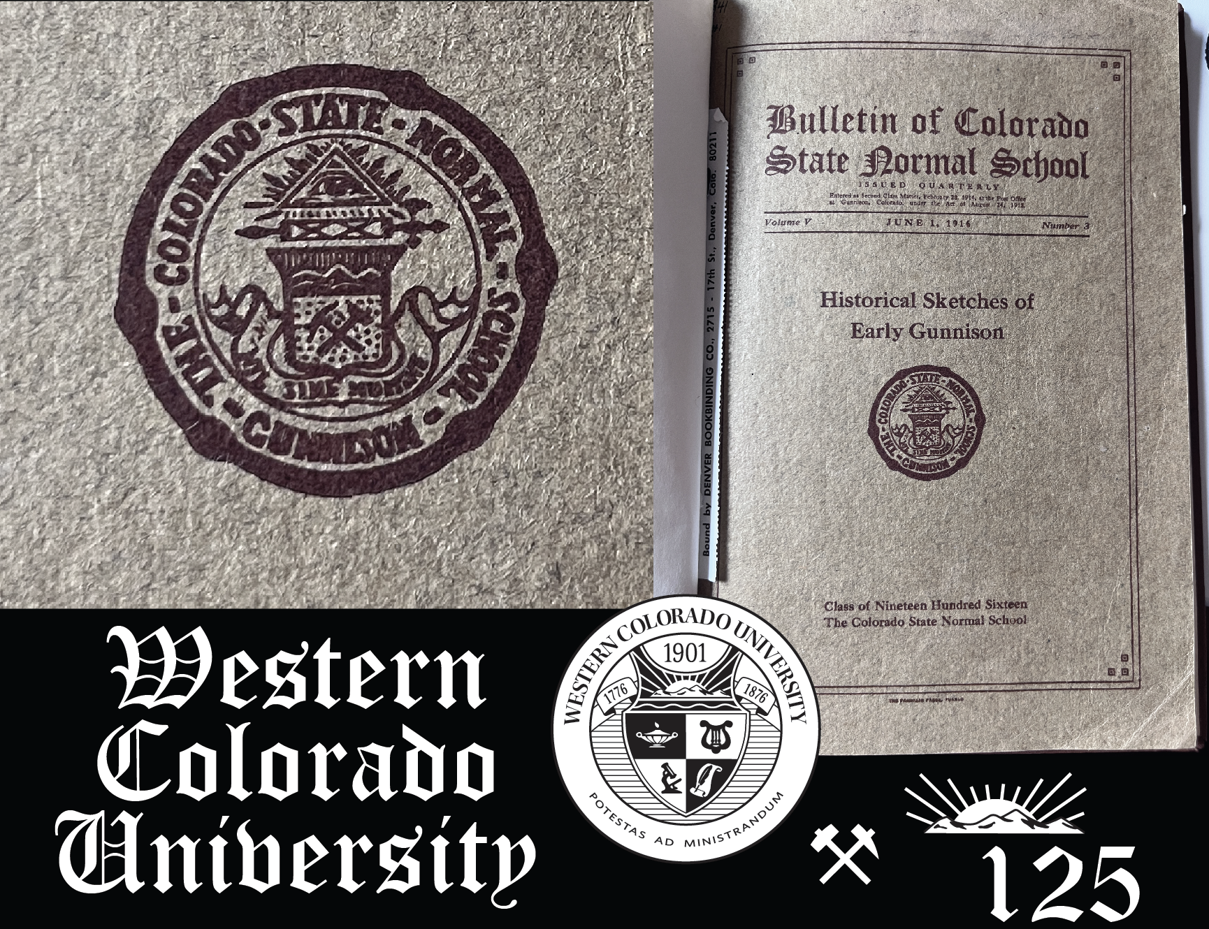
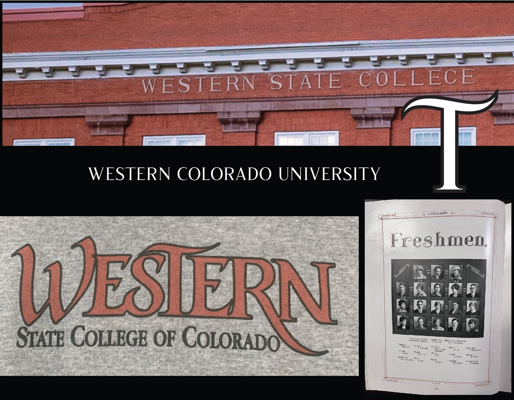
I spent weeks combing through old Western publications to get a sense of any old branding I could pull design inspiration from. Ultimately, I used a few iconic shapes and letter forms to create the final logo.
The Results
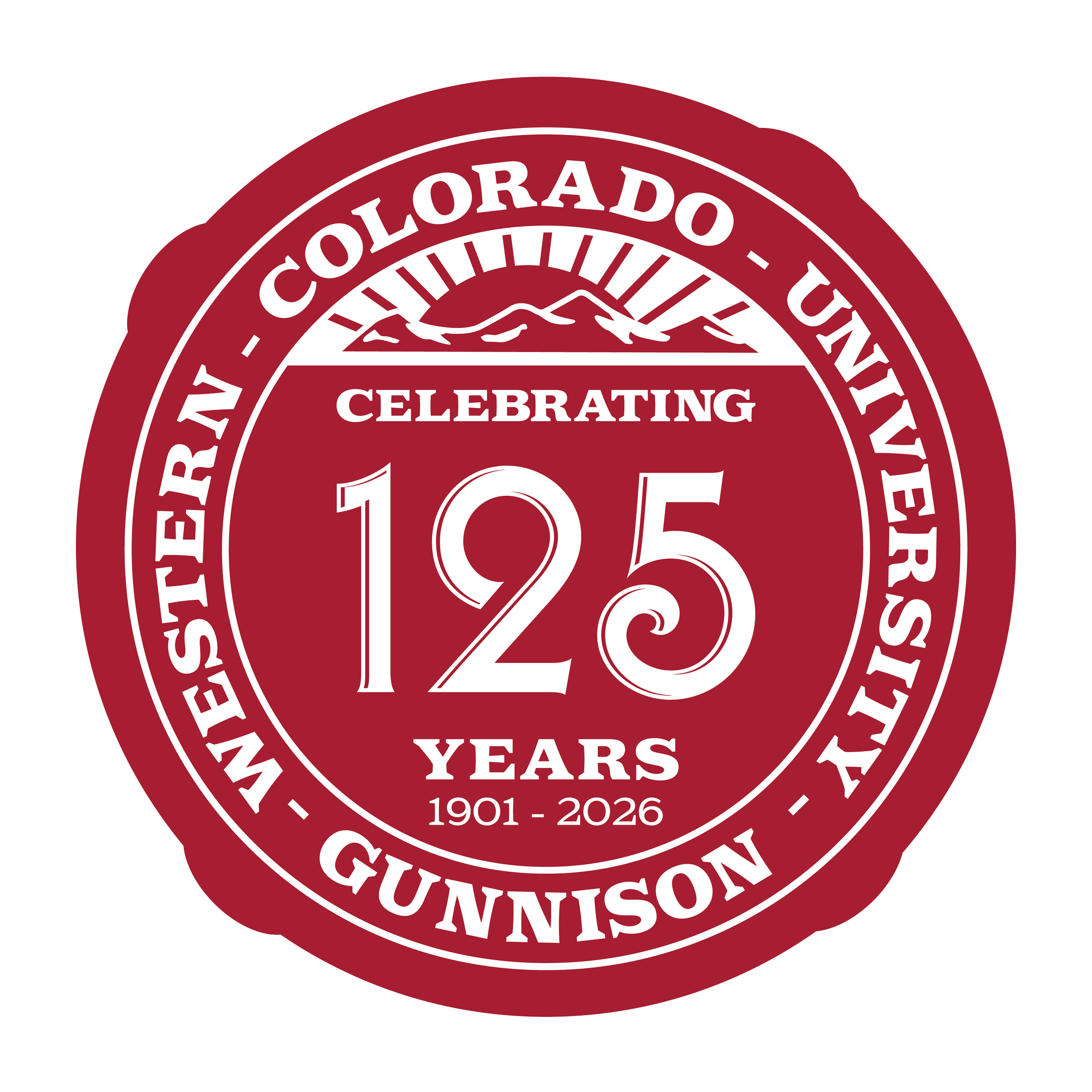
The Colorado State Normal School used a seal shape with nodes around the border. I adopted that style into the seal logo version.
Western’s current official logo seal uses a sun and mountain motif that I incorporated into the 125th seal logo.
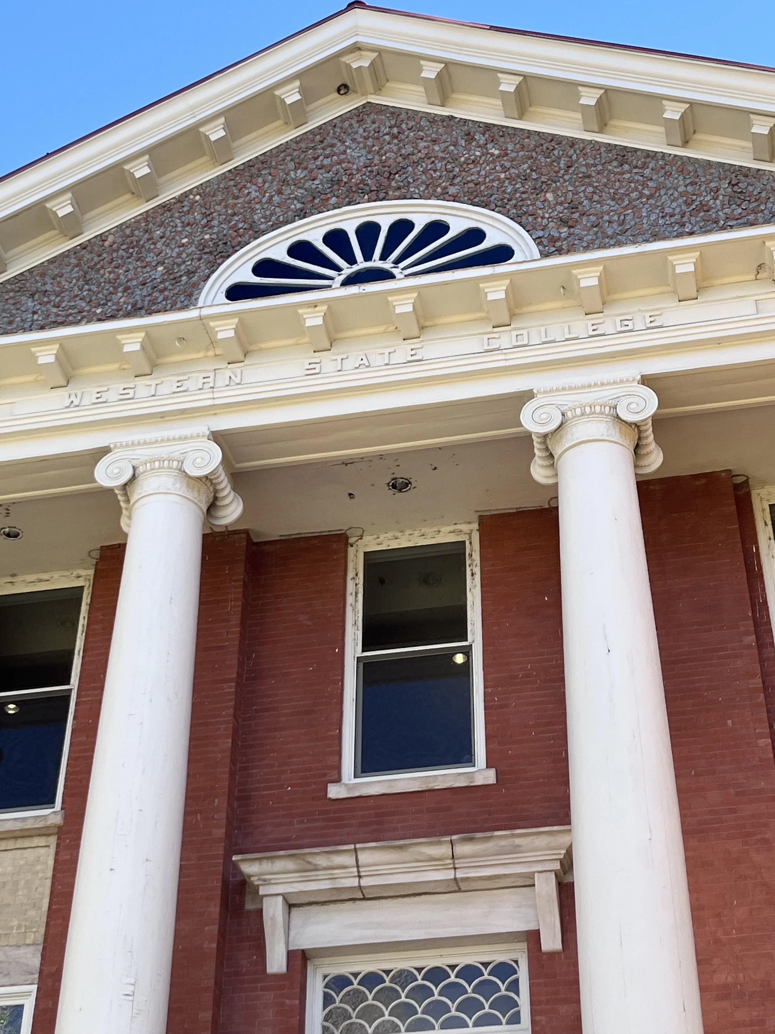
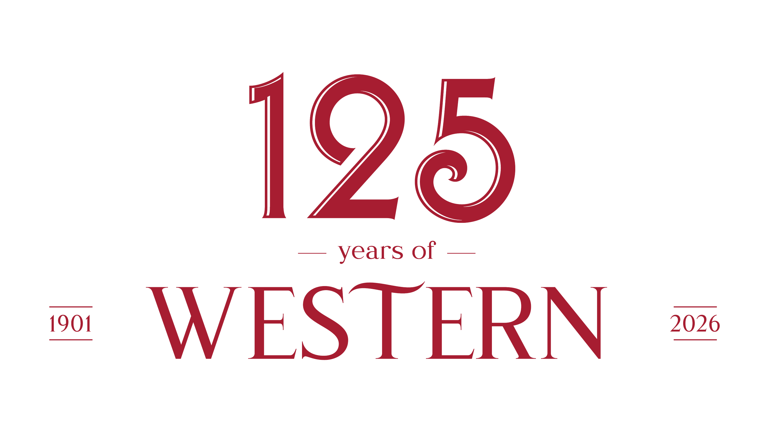
The typography I chose in the full logo form closely matches the typeface on Western’s most iconic building, Taylor Hall. The T letter form also mimicks the shape in the Western State College of Colorado logo, and is a nod to the branding of that era.
Deliverables + Brand Kit
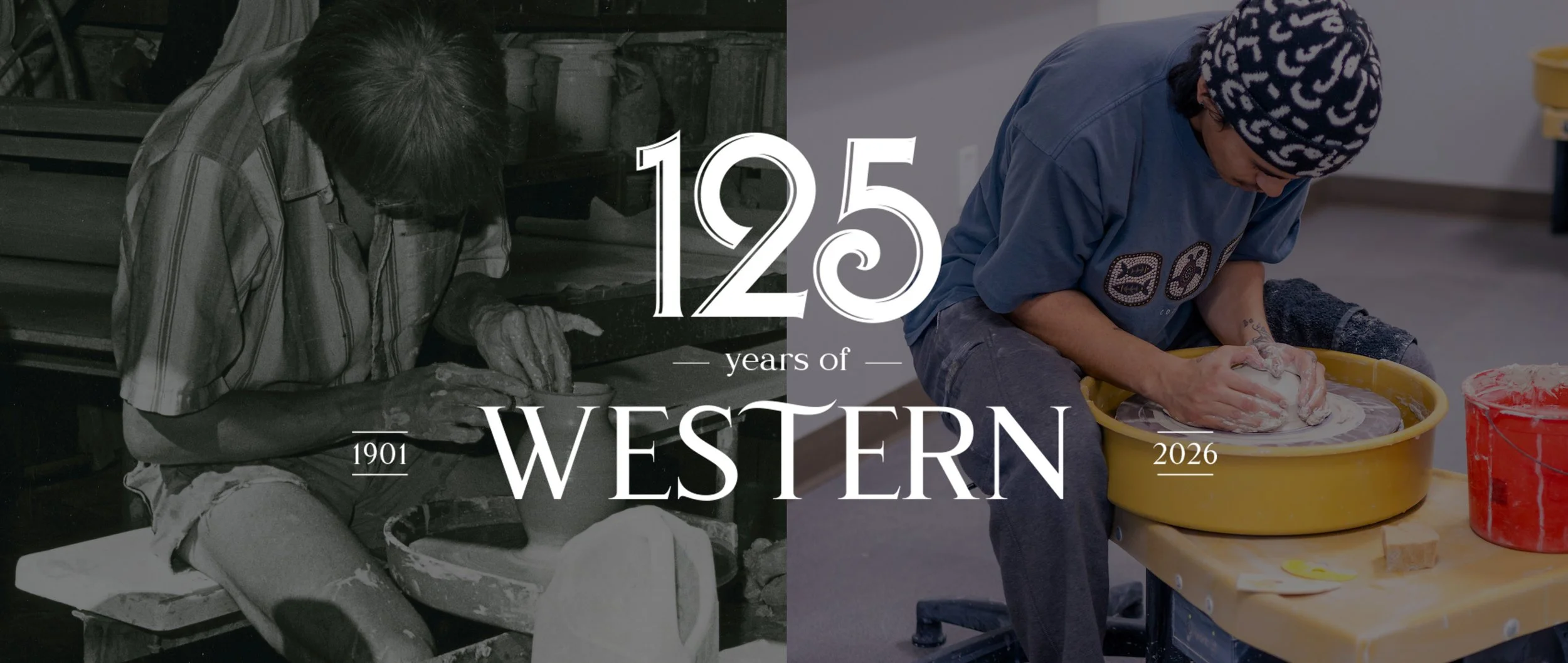
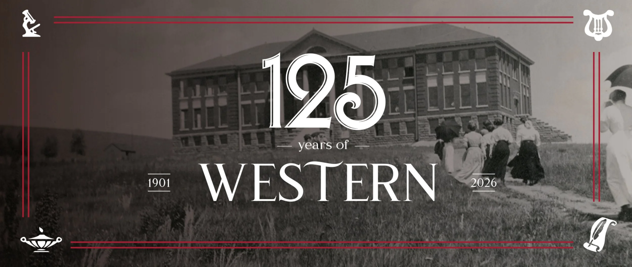
Aside from full logo deliverables, social media assets were also created to amplify the sense of how Western has evolved while remaining the same at its core values. I used imagery pulled from the Western archives to pair it with imagery from today.